Designing a Service Canvas Book (SCB)
“Ok, let’s add this new section in the Service Canvas poster.”
“Uhm, I’m afraid there’s no more space.”
“…”
>
“So, we need to go a little deeper on this topic.”
“I can add a line or two, but then we won’t have any space left.”
“Not even a bit?”
“Nope…”
“How can we communicate the complexity of this project then?”
>
Sometimes a project yields not just solved challenges, but new tools for future work, too. Read on for the story of how Cristina Paleari, Andrea Desiato and Alberto Sarullo created the Service Canvas Book, or head to Medium for the same article with more visuals.
During the early design phase of our latest project for an insurance company, we were struggling with the growing complexity of the services we were designing. We were, indeed, designing a network of five health-related micro-services, each independent yet part of one bigger whole. The aim of these services was to become part of a mobile application, a web portal and possibly other touchpoints.
As the project took shape many issues came up. We started to ask ourselves how to address them. When we started the project, we didn’t know that we would eventually come up with a new tool—a tool we could use to design many other services, too. But enough with the flashbacks; let us start from the beginning.
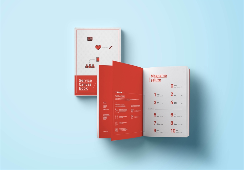
The Service Canvas Book as we see it
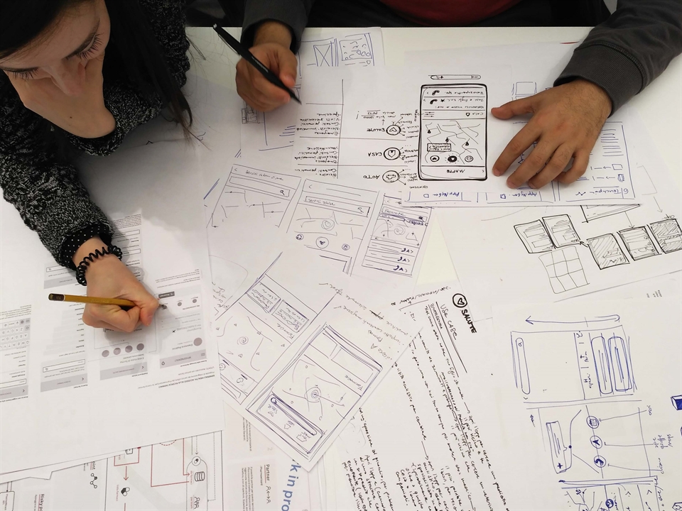
So, we are speaking about a weird thing we call a “Service Canvas Book” or, among friends, an “SCB,” but what is it exactly? The SCB is a combination of different things. Like a recipe for a cake, an SCB has many ingredients:
1/3 strategic design, as we were helping the company give shape to their ideas and structure a strategy for their new services.
1/3 user experience design, because we translated the services into a mobile application. And, last but not least,
1/3 data journeys, as we designed all the data flows to structure the information architecture.
Why did we need a tool?
To refer back to the beginning, we didn’t design the SCB just because of a lack of space on the original service canvas poster, of course. However, this was certainly the starting point. In the early stage of the process we used a basic tool that we called Service Canvas, a single-sided-poster split into different areas, one for each part of the service. This Service Canvas worked well as a synthesis for all the different parts of the service, but provided just an overview of them, with no possibilities to go deeper in analysis. That’s why, when the design process was becoming more and more complex, we realized that we needed to think about a tool specifically designed for our purposes.
One tool to rule them all
We knew that keeping every section in a single space was a key requirement for our new tool, as it would bring value both to ourselves and the people with whom we wanted to share the tool. Speaking of our needs: a single document would allow us to control each and every section. Having one section next to another would also help us work on the different parts of the service simultaneously, making it much easier to go through sections and navigate back and forth between them.
Operationally speaking, as we had to use the tool five times (once for each service), we wanted a single document to quickly update according to changes, feedback received and so on. To assure the document was always updated to the latest version, we were controlling versioning while keeping track of every release as well. Most importantly, we realized that having one, simple-to-understand and exhaustive tool would make it easier to share the project.
One tool to bring them all
We were sharing the project with more people than just the client. Our goal was to communicate the services to a number of other stakeholders in addition to the client. As you know, our client was an insurance company and we were working for them to develop a series of services.
What you don’t know, is that we were speaking with different departments within the corporation, as well as also speaking with start-ups and other companies to select partners, and at the same time working together with another design studio and a consultancy agency. In other words, the project involved a lot of different parties. So, our biggest challenge was to share our research, analysis and project with all of these stakeholders, using language and visual content that they all could understand.
How is SBC made?
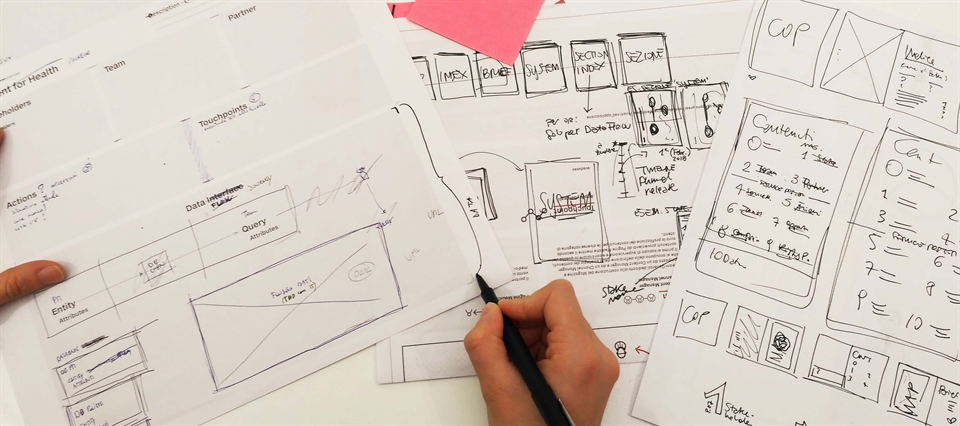
Finally, let’s look at how we made the Service Canvas Book. The whole book revolves around a service model section, which contains the map of the analyzed service. In addition to this, the book is made of ten sections in which we analyze the following aspects: project brief, stakeholders, team, partners, tasks, touchpoints, opportunities/constraints/risky points and data journey.
The stakeholder section was intended to map the complex and crowded nature of the project. Since the people involved were many, both from the project and the service side, we wanted to clarify tasks and responsibilities distributed among the different companies. We also categorized and listed the client’s internal stakeholders and final users. In the partner section, we mapped out the companies we were collaborating with.
We described the service through a service map, which explains how the whole system should work. We made two versions of it, as we expect two different releases of the app. The touchpoint section contains flows and wireframes that we designed. These translate the service into an app. We worked on the UX of the app, while another studio took care of the UI. We designed this section to communicate every detail of the app with them. Lastly, a data journey section was built to guide the IT team in its understanding of the data sources, storage and messages between entities.
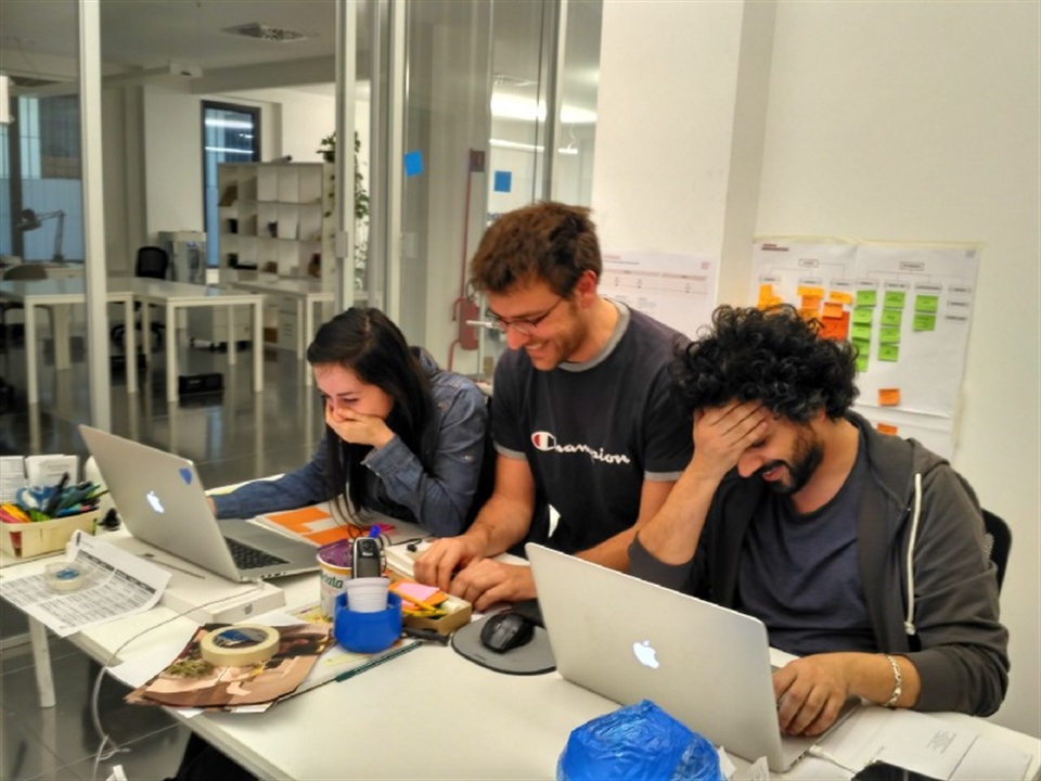
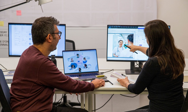
Us, in the war room, working hard, looking for space. But having fun.
In conclusion
As we were finishing up the project and talking to co-workers about the project and the tool that we were using, we realized that there was interest around the topic. So we decided to tell the story. The SCB may need some updates and fixes, but it is a tool that we will for sure use again, maybe adapting the format to meet the specific needs of other projects. We are thinking about an upgrade to digital as well.
We have worked hard on this challenge and we are proud of the SCB. The next step is to share it internally with the whole studio, and use it as a communication tool to speak about our service design skills.
To read the article with more visuals, head to Medium. Read more about the work of our digital and service design team here, and get in touch to discuss our Service Canvas Book. We look forward to hearing from you!
Team: Cristina Paleari, Andrea Desiato, Alberto Sarullo
